download.file("https://sta101-fa22.netlify.app/static/practice/eda_practice_template.qmd",
destfile = "eda-practice.qmd")Practice questions: exploratory data analysis
About
Below are some practice exam questions on exploratory data analysis. Please note that the exam will also cover linear regression introduced in weeks 3 and 4.
Getting started
Paste the code below to download a template file to answer the exercises.
Libraries
library(tidyverse)
library(viridis)
Data
The dataset for these practice questions comes from the ggplot package (loaded with the tidyverse) and contains fuel economy data on 38 popular models of cars from 1999 to 2008. Be sure to check out ?mpg for more info, especially to understand the column names.
data(mpg)Exercises
How many observations are in the
mpgdata set? How many variables?Create a scatterplot with engine displacement on the x-axis and city miles per gallon (mpg) on the y-axis, color the points by the number of cylinders the vehicle has. Be sure to appropriately label the axes and give your graph a title. Discuss any trends you notice.
What proportion of vehicles in the dataset have a 4 cylinder engine? What proportion have an 8 cylinder engine?
Create a new column called
avg_mpgthat reports the average mpg a vehicle gets between city and highway. Save your new data frame asmpg2.
- Recreate the plot below. Make sure axes and title labels are exactly matching, including spelling, capitalization, etc.
- Hint: you should use your
mpg2dataset. Also, if you try, e.g.aes(x = cyl)you will not see the correct plot becauseRthinks the number of cylinders is continuous. Instead tryaes(x = as.factor(cyl))to make it a discrete category. If you are unsure what geometry to use, check out a list of common geometries here.
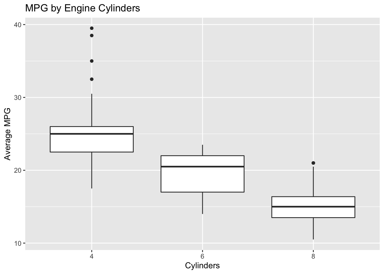
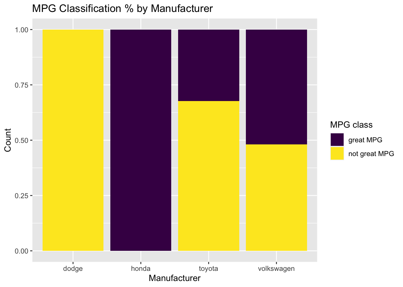
- Create a new column titled
mpg_classthat labels a vehicle as “great mpg” if average mpg is greater than or equal to 25 mpg, and “not great mpg” if average mpg is less than 25 mpg. Next, recreate the plot below. Make sure axes and title labels are exactly matching, including spelling, capitalization, etc. Is the figure informative? Why or why not?
- Hint: start with your
mpg2dataset again. You will need to usefilter()paired with the appropriate logic to plot only a subset of the data. See ae3 for more information onfilter(). You will need to use the viridis package to obtain the correct color scheme. check?scale_fill_viridisfor more information.
- Find the mean
avg_mpgper manufacturer and then sort the resulting data frame so that the most fuel-efficient auto manufacturers appear first. (i.e. highest MPG manufacturers at the top). Print the five most fuel-efficient manufacturers to the screen.